Design Assembly: Auckland Super City Logo
Written by
By Louise Kellerman
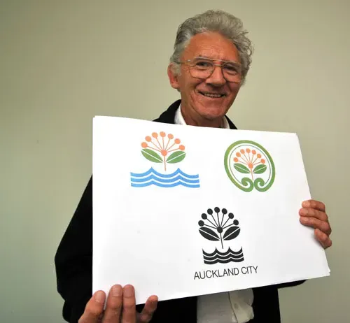
The winner of the Auckland Council logo competition was revealed on Friday. It takes the form of a stylised pohutukawa designed by retired commercial artist Jim Dean, of Manukau City.
The design was chosen from more than 1500 entries and won according to Hamish Keith because:
- It fits the prescription of being concise, elegant and compelling.
- It is not a stereotype.
- It is an image to which all Aucklanders can relate.
- It evokes the geography of the region.
- It is flexible and can be adapted to a variety of uses – from vehicle doors to shoulder patches, letterheads, signs and bin markers.
- It has high readability.
- It provides the new council, if they wish, with an official flower.
So what do I think? I find it interesting that Mr Dean did actually work as a commercial artist, to me this shows that a level of professional expertise was indeed needed to come up with a concept that had the merit to win and that developed craft skills were needed to realise the concept.
I like the ideas behind the mark, but feel that it maybe looks dated already with the colour choices and style in which the concept has been drawn up. I feel that the typography needs more personality and crafting still.
But it must be noted that Mr Dean will now work with professional designers to develop finished artwork for the Auckland Council which can be used on everything from websites and signage, to legal notices and rubbish bins. (www.ata.govt.nz)
So lets talk about what the process so far and what it has uncovered - WIN or FAIL?
But I’m going to reserve my final judgment and wait and see what the relationship between Mr Dean and the ‘professionals’ develop from this…
And as @_amber says: “We’re all girl guides and we just earnt the #aucklandcitylogo badge…”