Final four flags revealed
Written by
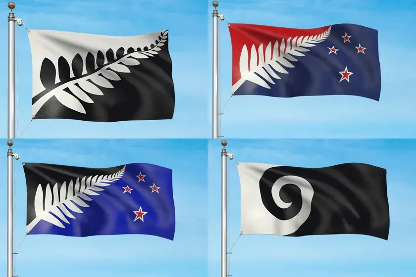
There’s no stopping the New Zealand flag debate. From more than 10,000 submissions, to a shortlist of 40 possible designs, the final four cabinet-approved designs to be pit against the original flag were revealed on Tuesday.
Here are some responses, courtesy of Design Assembly.

The final four shown above are designed by (from top left) Alofi Kanter, Kyle Lockwood, Kyle Lockwood (x2!) and Andrew Fyfe. Not surprisingly, three of the four feature the prime minister’s favoured fern motifs.
Alofi Kanter’s Silver Fern (Black & White): “The fern has been a distinctive symbol of New Zealand for the past 100 years. Strong and simple, it represents our uniqueness as Aotearoa New Zealand and the black and white colours show our ‘yin and yang’, with the softly curved spine of the frond binding us all together as a young, independent and proud nation. Credit for the fern goes to The New Zealand Way Limited.”
Silver Fern (Red, White & Blue) by Kyle Lockwood: “The silver fern: A New Zealand icon for over 160 years, worn proudly by many generations. The fern is an element of indigenous flora representing the growth of our nation. The multiple points of the fern leaf represent Aotearoa’s peaceful multicultural society, a single fern spreading upwards represents that we are all one people growing onward into the future. The red represents our heritage and sacrifices made. Blue represents our clear atmosphere and the Pacific Ocean, over which all New Zealanders, or their ancestors, crossed to get here. The Southern Cross represents our geographic location in the antipodes. It has been used as a navigational aid for centuries and it helped guide early settlers to our islands.”
Silver Fern (Black, White & Blue) by Kyle Lockwood: “The silver fern: A New Zealand icon for over 160 years, worn proudly by many generations. The fern is an element of indigenous flora representing the growth of our nation. The multiple points of the fern leaf represent Aotearoa’s peaceful multicultural society, a single fern spreading upwards represents that we are all one people growing onward into the future. The bright blue represents our clear atmosphere and the Pacific Ocean, over which all New Zealanders, or their ancestors, crossed to get here. The Southern Cross represents our geographic location in the antipodes. It has been used as a navigational aid for centuries and it helped guide early settlers to our islands.”
Koru by Andrew Fyfe: “As our flag unfurls, so too does its koru. The koru represents the fern frond, but is also reminiscent of a wave, a cloud, and a ram’s horn. In Maori kowhaiwhai patterns the koru represent new life, growth, strength and peace, and for this reason has taken a special place in Aotearoa’s visual language.”
Here are some responses to the designs, courtesy of Design Assembly.
Michael Smythe
I was wrong! It’s not a fern foisting conspiracy – it’s a fern foisting fact!
John Key is now being shamelessly explicit, favouring the Kyle Lockwood tea towel designs, and his mate Sir (pending) Richie McCaw has spoken. We are being set up to feel outside the in-crowd if we do anything other than vote for a fern.

If we are to adopt the fern as part of a comprehensive branding exercise it would make most sense to employ the black-and-white ‘New Zealand Way’ version, as proposed by Alofi Kanter. But I would prefer to see the black and white reversed. Andrew Fyfe’s koru option is bold and simple but again I would reverse the black and white. Air New Zealand has been taking the koru to the world since 1965 so it is as legitimate as the silver fern when it comes to building a brand family.
Meanwhile I shall settle in to my position outside the in-crowd and wonder why none of the long list designs that I favoured made short list.
Michael Smythe is a design practitioner, strategist, curator and writer with Creationz Consultants. He is the author of NEW ZEALAND BY DESIGN: a history of New Zealand product design (Best First Book of Non Fiction at the 2012 New Zealand Post Book Awards). He dreams of establishing designarc – the New Zealand Design Archive and Research Centre – www.designarc.org.nz
Peter Gilderdale
The selection is predictable. Given that the process has been consistently mismanaged thus far one would not expect anything different here. Why, one has to ask, have two versions of the PM’s favoured Kyle Lockwood design been included in the final four? That will actually split the Lockwood vote, and make it more likely that we end up with a black flag. I know we are a Rugby-obsessed nation, but are we so naval gazing that we can’t see the connotations of a black flag. The vast majority of the world have no knowledge of Rugby and the All Blacks (think the US for a start). Even the PM dropped his advocacy of a black flag in the face of ISIS. However, if we are determined to appear on the international stage in Emo garb, there is not much one can do about it. Other than redesign the flag when we finally grow up, and start thinking about how others are going to perceive our attempts at self-expression.
Dr Peter Gilderdale is a senior lecturer in design history and theory at AUT.
Laura Cibilich
I was actually quite excited at the thought of our national flag being redesigned. Instant thoughts of a flag kiwis could be proud of, that would be able to stack up alongside the great designs of Canada, Japan and Jamaica came to mind. Today those thoughts have been shattered. I can’t say I was really excited about any in the long list of 40, but I was actually really disappointed to see the top four that will be put forward to a national referendum. I think it’s such a wasted opportunity. To have all four feature a variation of a fern so heavily, three of the top four all so similar and two just with a different colour way, just makes me mad! Surely the panel could have done better or even been advised better. As a designer, when presenting to a panel we’d never give three variations of the same design. We’d of course narrow those down to the best of four very different designs, so at least New Zealanders had a chance to have a say. It’s like we’re not being given a choice of designs at all. Definitely a wasted opportunity to say the least. For a country that is supposed to breed innovation this shows a lack of vision. With such a botched process I guess we were doomed from the start. A very sad day for NZ design.
Laura Cibilich is Design Director and founder of Auckland based design and advertising agency Designstein. She is experienced in working across multiple international brands, with particular expertise in brand ideation and typography.

Carol Green
The short list is even worse than I thought it would be. Presumably NZTE logo will be disqualified before February, and they chose the least-likely-to-suceed koru, leaving the path smoothe for the two Lockwoods…
Prepare for some heavy-handed ‘campaigning’ for the Prime Minister’s preferred option.
Carol Green is mostly a self-employed front-end web developer but also makes some art.
She has opinions on Twitter.
Sarah Ritchie
This is a sad day for New Zealand, as a country and as a design community. The death knell in the flag design process has been struck. I couldn’t be more disappointed. Why have two of the same design with just a different colour palette? Talk about “leading” New Zealand voters a certain way! To make matters worse, the combination of the fern and Southern Cross is a sickening compromise between old and new which — as any design student could tell you —just doesn’t work. Does this mean we vote to keep the current flag? Such a waste of money.
Sarah Ritchie has been in the design and agency world for 25 years. Originally a graphic designer, Sarah has also worked as a design teacher, account manager, and now enjoys a wonderful life in recruitment for agencies. Sarah is also the Founder of AM-Insider — a website full of tips, tricks and resources to build account management superstars!
Zoe Nash
The outcome of this “selection” was completely predictable from the start. It comes as absolutely no surprise that we have three ferns and a koru, which I suspect will be first in line to be eliminated. Personally, I believe that decisions were made months ago and the public process is merely an outward pantomime-esque demonstration of a general consensus.
There were a myriad of interesting alternatives initially submitted (see Carol Green’s alternative list of 40 which features a bright, vibrant assortment demonstrating original thinking, humour, irony…). Admittedly, it’s probably not best practice to put ourselves out there under the banner of a swandri (an in-joke that the rest of the world may not “get”), but a lot of these alternative options showed a unique voice and made a more considered effort at pinpointing kiwi identity.
Disappointed…
Zoe Nash is a multidisciplinary practitioner and part-time design and visual arts tertiary lecturer. She also assists in the day-to-day running of Design Assembly.