Responses to NZ flag designs
Written by
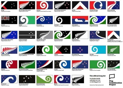
Last week the Flag Consideration Panel released the 'long list' of 40 possible design options for New Zealand’s new flag, dominated by layouts featuring korus, ferns and stars.
This significant national design project continues to be met with mixed responses from New Zealand’s creative communities. Here are some of the conversations, courtesy of Design Assembly.

The Flag Consideration Panel released its long list of 40 designs on August 10, 2015. From these selections, just four will be chosen in mid-September to go forward to a national referendum.
Louise Kellerman
The long list of 40 flag designs has been chosen by the flag consideration panel. This part of the process interests me – only when people are presented with a manageable number of options are they able to form opinions around the whole project. Perhaps this is what this long list of 40 has been designed to do – provoke response and debate.
In my opinion, the list contradicts the stated process. It includes many variations on themes – not 40 different flag designs to be whittled down. Wasn’t this stage supposed to draw out 40 different options? Not to show the obvious direction towards which we are being steered.
Take out the variations on the fern and koru and the colour variations, which represent at least 27/40 and we are left with a possible 13 different choices… kind of. In the next stage of the process let’s hope we see four distinct design directions.
It is great to see the designs submitted by professional designers included in the long list of 40. In particular:

Wa kainga / Home by Studio Alexander
Manawa (Black and Green) by Otis Frizzell
Huihui / Together by Sven Baker
Finding Unity in Community by Dave Sauvage
Well, that’s four.
Louise Kellerman is the founder and director of Design Assembly
Peter Gilderdale
The flag debate is becoming an exercise in national self-discovery. As such it is useful, but I suspect that whichever design wins out of this process will do so purely because it speaks to who we are now. If that happens, then we can expect to revisit the process in another generation, as it won’t represent who we have become. There are a few workable designs amongst the forty. Studio Alexander’s design has the iconic quality that a flag needs to function over time. There are a couple of others that could do this, but I don’t think they are going to be the ones that get chosen. We are still caught in emblem fever, and if we continue to treat the exercise as one of self-expression rather than communication, then we will get a flag that only talks to the present, not to the future.
Dr Peter Gilderdale is a senior lecturer in design history and theory at AUT.
Michael Smythe
Where are the Walters options?
It’s a puzzlement! Alongside the plethora of ferns and stars there are multiple variations on the curvilinear koru but only one that employs the Gordon Walters approach. Walters solved the problem of honouring Maori without creating art that seemed exclusively Maori.
Maori heritage is the unique point of difference that distinguishes New Zealand. Representing New Zealand as purely Maori is as inaccurate as ignoring its significance. By distilling the koru to its simplest form and exploring the abstracted interplay of background and foreground Walters created a rich visual language that can be seen as inclusive without being exclusive.
I submitted three variations on a Walters-inspired flag that invited both a bicultural and a multicultural reading (black and silver version below left). Other submissions were Walters inspired. Only Sven Baker’s Huihui/Together design was included in the long list (below centre). I like it but I am itching to tweak it (as is normal at this stage of the design process).
Gaps are needed between the nodules and stripes. The gaps became smaller in Walters’ later works, eg: Maheno in 1981 compared to Painting No.1 in 1965, but they never touched. A darker blue is needed. Traditional heraldry requires blue and red to be separated by a ‘metal’ (silver/white or gold/yellow) but the need to improve visibility from a distance can be assisted by increasing tonal contrast. Also, a darker blue and a brighter red will make it look less like a modified Russian flag.
And when some wit suggests Sven’s flag looks like a tape cassette we can say that’s fine – it rewinds to our heritage and fast-forwards to the future!
Why no room for the elephant?
About thirty years ago the Export Institute ran a competition to create a consistent symbol to identify New Zealand but they avoided including the flag. Next came The New Zealand Way which evolved into the increasingly prolific ‘Official New Zealand Fern Mark’. Now we have a reverse scenario – the flag is being considered without reference to the other ways we visually identify this country. The elephant is not even in the room.
If we had taken a comprehensive approach we would have first discussed our national colour(s). We all know that the emergent national colours are black and silver. There are problems with a flag bearing a white motif on a black background (ISIS, Jolly Roger, etc) but a lively interaction between black and white or silver can work well. Such a colour scheme would stand out from the crowd at global gatherings. But we would have to dare to be different.
My ‘Interactive Nation’ flag proposals took the wider branding opportunities into account even though it was not part of the brief. Here are some applications requiring consideration:

Only two designers in the Top 40 have used the New Zealand Way ‘Official New Zealand Fern Mark’ thus aligning with existing branding elements. Alofi Kanter’s ‘Black and White Fern’ options (below left and centre) use it in a way that avoids white on black. Sven Baker’s ‘Silver Fern (Black and Silver)’ eschews black in favour of greys (below right).

The populist democratic process we are undertaking will favour the familiarity of red white and blue – the biggest cliche in flag design (along with stars). I fear that the outcome will be a fern flag with a bit of black added to the red white and blue.
We could have done so much better…

Don’t it always seem to go – you come up with the absolutely obvious iconic answer after the deadline!
Michael Smythe is a design practitioner, strategist, curator and writer with Creationz Consultants. He is the author of NEW ZEALAND BY DESIGN: a history of New Zealand product design (Best First Book of Non Fiction at the 2012 New Zealand Post Book Awards). He dreams of establishing designarc – the New Zealand Design Archive and Research Centre.
Sarah Ritchie
Two fundamental principles of commercial graphic design are: all designs should “work”, and be understood, without needing explanation; and that all design needs to be backed by solid rationale. This is because the objective of most commercial graphic design projects have to result in a tangible ROI for our clients. Are we meant to make our flag-choice based on the design being “graphic design for commercial return” or simply an artistic interpretation of what it means to be “New Zealand” and a New Zealander.
During one heated water-cooler debate I heard a flag-comment, “But I just don’t understand it”. I thought about the South African flag – my co-favourite flag design along with the Union Jack. I would assume that every single part of the South African flag (shapes and colours) “mean” something significant. Do I know what the meaning is? No. Do I need to know in order to like it and identify the flag with South Africa? No.
Then you have the Canadian flag. To those who have a rudimentary knowledge of Canada, it’s immediately easy to see the correlation between a maple leaf and Canada. Does that mean the Canadian flag is any more or less “effective”, “patriotic” or “better” than the South African flag? No.
I feel our NZ flag choice is going to come down to whether people individually “like” the design and resonate with it, or not. Those that think on a deeper design-theory level will likely choose a design that is more oblique. Those who need to connect with well-known symbolism will likely choose a design they understand (koru, Southern Cross, silver fern). Does that make the individual reasons for the choices right or wrong? No. Does that mean the flag-design-debate is multi-layered, complex and – to a great extent – moot? You betcha!
Sarah Ritchie has been in the design and agency world for 25 years. Originally a graphic designer, Sarah has also worked as a design teacher, account manager, and now enjoys a wonderful life in recruitment for agencies. Sarah is also the Founder of AM-Insider — a website full of tips, tricks and resources to build account management superstars!
Zoe Nash
I’m a huge fan of the Walters-inspired submissions (particularly Smythe’s versions). I’m disappointed none of them made the final cut. I think these most strongly reflected New Zealand’s history while simultaneously giving nod to its flora, fauna, and indigenous culture. New Zealand is often rapidly dismissive of past endeavours, and quick to replace the old with the new, ditto the rejection of anything representative of our colonial history in favour of something that reflects a potentially more republican future. The haste to fast-track the flag “issue” reeks of personal legacy-leaving rather than providing a viable long-term forum in which to create carefully considered symbolism.
I was interested to see the below pop up in a recent newsfeed. It comes courtesy of Jack Gray, Te Rarawa/Ngati Porou Contemporary Dance Artist/Facilitator, and I wonder if its accompanying commentary is somehow reflective of how many Maori respond to these selections, and the process in general?
“I think what’s confusing the flag issue are the colours. Check the NZ flag options out again without all the blue and green lollipop distraction. WAAY BETTER, right??? Suddenly the koru doesn’t look ‘tokenistic’ and has more mana. We have to not be afraid to own that Aotearoa is home to the Maori. That’s what is so special, intrinsic and BEAUTIFUL about this nation. Celebrate the mana.”

Just how engaged are Maori in the flag selection process and, on a wider scale, what of our multi cultural voice? Are swirls and ferns really all that we have to offer?
The proliferation of diagonal visual disruption, I think, also fails to reference what fundamentally makes New Zealand, New Zealand, and that is the landscape. Only two out of these 40 submissions use any kind of horizon-line reference.
Oh dear… this could all go so horribly wrong.
Zoe Nash is a multidisciplinary practitioner and part-time design and visual arts tertiary lecturer. She also assists in the day-to-day running of Design Assembly.
Alistair McCready
There’s an invisible wall of disconnect that runs throughout New Zealand’s design community. There are those training to enter the industry, and those that are already part of it. In recent years, I’ve founds myself darting over to each side, as both a student and a practicing designer. You begin to see how much one depends on the other, yet somehow along the way there has been a breakdown in communication, and subsequently neither side really knows how to converse with the other.
The same can be said for the wider picture that is New Zealand. As a young, yet fast growing nation the question of who we are, and how we are presented to the wider world is constantly being asked. A topic such as the redesign of our nation’s flag is something we as designers can truly engage with… yet from where I stand I’ve seen a lot of apathy toward the subject. Perhaps this is because of the aforementioned disconnect.
Flags have always existed to symbolise a collective. A beacon or symbol that represents multiple people. However, in order for this to be effective, those involved need to be willing to unite in the first place. Instead—this process has constantly been about one community versus the other. The divide just grew even bigger.
Alistair has honed his fervour for design through his early discovering of fine things, dry wit, and background as a trained screen printer. Personal interests that influence his work include history, local heritage and, what some might say is, his unrelenting obsession with detail. Al is married to Liz, and together they are Betty&Al – a multi-disciplined design studio specialising in merchandise. You can also find him roaming the halls at the AUT School of Art & Design, where besides futhering his design studies, he is a catalyst in increasing the levels of community and good taste.
Gerbrand van Melle
After following the submissions to the Flag Consideration Project for a while it became clear that a large group of non professional designers entered this home. That is alright. You open a process to the public and that is what you get. And hey, everyone is a designer nowadays, there are just not many good ones. It was the refreshing design approach by Kris Sowersby that inspired me to submit some designs myself as well. I could see the power of Kris’ new simple language resulting into new icons. It does not take much time to embrace this innovative approach, playfully defining a novel language without the traditional icons we already know; the fern, the koru, the southern cross. The long list needed this.
The opportunity to realise a new symbol has not completely filtered down into the presented shortlist. The repetition of slightly aesthetic differences only clearly chimes with the shared traditional mindset of the—non designer—panel members. It was very clear on August 10th that the New Zealand design loving community on Twitter was deeply disappointed with the presented list. When we take this traditional approach one step further it is very well possible that the current flag will stand the referendum against the final new flag design. The public will decide. The design of the design process allowed for this to happen. Maybe Flagpost will rise an alternative voice.
Gerbrand van Melle started his design career in the early nineties. With friends from design school he started a cooperative group of creative talents called AAP – ‘Monkey’ in Dutch. Besides applied work, time was always found for non commercial projects, like experimental movies and games. Major clients included SRON Netherlands Institute for Space Research, Utrecht University, National Museum from Musical Clock to Street Organ and music venue Tivoli. Since 1996 he was involved as a Senior Lecturer in Typography and Motion Graphics at Utrecht School of the Arts and from 2008-2010 in Typography at Massey University. In 2013 he joined the team at Colab.
Carol Green
Didn’t have time to look through all 10,292 designs? Don’t worry, I did it for you (you’re welcome). Here’s my own long list of 40. They are in no particular order. A large version of this image can be downloaded here.

Carol Green is mostly a self-employed front-end web developer but also makes some art. She has opinions on Twitter.
- Courtesy of Design Assembly / conversations on graphic design