The MsBehaviour Files: Information Aesthetics
Written by
The new chic in geek speak is to talk about The Cloud. It's the noughties name for a place once known as Cyberspace. Until recently the Internet has been hard to conceptualise, which is why I find the new wave of 'Information Aesthetics' so exciting. Drawn from the worlds of science, art and technology are some stunning images that let you see parts of cyberspace, like the map that shows how the network mesh of the internet looks like jellyfish, and how the pulse of millions of Facebook messages look like a heartbeat.The new chic in geek speak is to talk about The Cloud. It's the noughties name for a place once known as Cyberspace. Until recently the Internet has been hard to conceptualise, which is why I find the new wave of 'Information Aesthetics' so exciting. Drawn from the worlds of science, art and technology are some stunning images that let you see parts of cyberspace, like the map that shows how the network mesh of the internet looks like jellyfish, and how the pulse of millions of Facebook messages look like a heartbeat.One site that really inspires me is Visual Complexity, a visual exploration on mapping complex networks. Visual Complexity is what I would call a true Renaissance Space. It draws together what are normally diverse fields such as as Art, Biology, Food Webs and Knowledge Networks.You can view the beauty of a Protein Homology Graph from the Institute for Cellular and Molecular Biology at the University of Texas, see the IRC Arcs drawn from communications on a social network, or the Micro Fashion Network of colour trends.
Also known as Mapping or Data Visualisation, MIT calls this "a young discipline that mixes graphic design and statistical analysis in attempts to represent information with pictures instead of raw data". The interactive art and design Swicki run by Chris Barker has an enormous list of links. If you need to get any work done then save this for a weekend, otherwise you could be lost in here for hours like I was. Swickis are powered by Eurekster, a clever social search company from New Zealand.
The Digg Labs are also worth a visit to view community data flows in action. San Francisco-based Stamen Design was commissioned to help develop new visual interfaces for social news site Digg. Their brief was to find connections within the flow of Digg's social news content. The four Flash-based applications are visually very different. The first, Swarm, is my favourite as it shows the interconnections between users and stories. Stack shows the user rating system in real time as votes or 'diggs' come in. Big Spy is another way to view 'diggs' and popular stories are 'weighted' with a larger text size. The newest interface is Arc which displays stories, topics, and containers wrapped around a sphere. Again, you can view at a glance the popularity of content as stories with more 'diggs' make thicker arcs.
These visual representations convey both meaning and data beautifully, but are not necessarily going to replace the web as we know it. I see them more as an extra lens to view data previously buried in databases and spreadsheets, which will hopefully allow us to see new creative connections and make leaps of intuition. So what will the web look like in a few years? I think parts of it will still be familiar. There are good reasons for keeping a simple interface for publishing data like text, though mobile delivery may change this. Dynamic interfaces are not always best for conveying information, and personally I like to be able to view data in a number of different ways. I think we'll see more companies like Digg offering personalised filters and viewing options for their content.
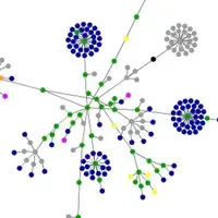
If you are inspired by the art of data visualisation, then keep an eye on the Infosthetics blog for links and videos. If you are a Flickr or Last FM user then you can have play with the alpha release of Fidg't Visualizer to map your own photo or music networks. The Twingly screensaver (PC only) allows you to visualise global blog activity in real time. My favourite is the website visualisation generator, which I used to create the image of The Big Idea (shown above). The colours represent links, images, and tags generated from the content and links. To me, The Big Idea looks like a bunch of pohutakawa flowers.
30/8/07
As well as being TBI's strategist, Helen Baxter a.k.a. MsBehaviour runs dance-music label TMet Recordings, 3D animation company Mohawk Media and has a fortnightly slot on National Radio called 'Virtual World'.